3.1 - Widgets!
I’m gonna take a couple minutes and talk about widgets. When I sat down to sketch out a plan for Albums widgets, I went back to the Well of Selfishness. As a power user of the app I just so happen to develop, I have lots of opinions about it. If only the developer was more responsive…
I didn’t start out thinking in terms of widget types or design. Instead, I had a nice little think about the things that I wish I didn’t have to open Albums to do. Here’s what I came up with:
It’s annoying to have to open Albums or ask Siri to find out when the Now Playing album is ending
When I wake up at 5:30AM and can’t fall back asleep and thus commence the ritual of checking all the stupid apps on my stupid phone, I want easy access to albums that came out today in history
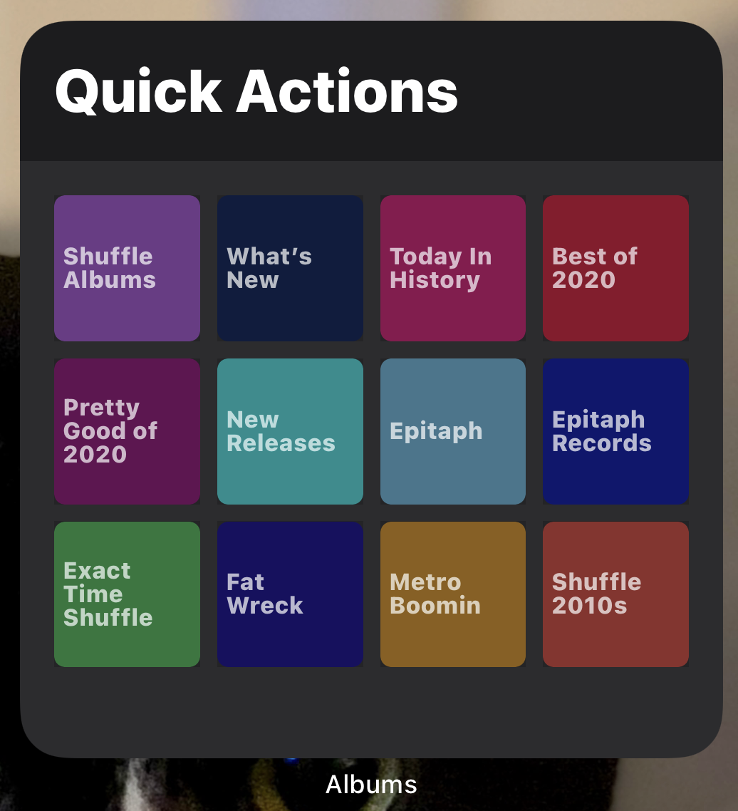
I don’t want to have to open Albums or remember the Siri Shortcut I configured just to run a quick action.
Fleshing out those ideas a bit, it seemed like I had myself three widgets: Now Playing, Collection, and Quick Action.
Now Playing
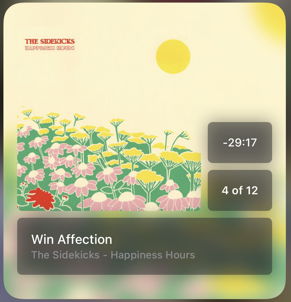
This is Albums, right? You’re listening to an album. You want to feel the album you’re listening to. It felt right design-wise to try to celebrate the album art as much as possible, in keeping with the vibe of the Now Playing screen in the app proper. There’s also a certain amount of information I wanted to convey that I knew I wasn’t going to be able to shove into the small widget size. So… I just made it the album art.
After a little bit of clever math, I got the countdown working in the medium and large widgets, then added the ability to customize the widget to hide it in case that’s not your vibe. Those sizes include information to help you immediately grok your place in an album. The Now Playing widget does not tell you what is coming up next, regardless of widget size. Stay in the moment.
I use the small size in place of the Albums icon on my home screen and the medium size in the widget area so I can swipe over from the lock screen and see time remaining whenever I want, damn it.
Collection
It took, like, 15 minutes to get up and running with the Today in History widget proof of concept. It took much longer than that to add all the other customization options. It offers several built-in Insight Collections, like Recent Favorites or New Releases, but its real power is that you can customize it to show and get quick access to any collection in your library. Tapping the title opens the full collection, and tapping individual albums opens them.
I struggled a little bit with deciding when to update the albums shown in the Collection widget. I landed on having albums rotate every half hour. Why not?
I’ve got Today in History (large), New Releases (medium), and Recent Favorites (medium) scattered throughout my home screens.
Quick Actions
Wow, Adam, how did you ever think of the genius idea to take all the little rounded squares that do stuff when you tap them and put them in a widget? I mean, wow, a grid of squares? Pretty smart, dude.
I use the big one because I’ve got… a lot of quick actions.


